Context
Southwestern Law School's new Identity
As a part of their rebranding, Southwestern Law School is updating their site to improve user flow.
Project: Webpage Redesign
Role: Visual Designer
Team: Visual Designer, CMO
Tools: Figma, Adobe Creative Suite
Status: Last stages, launching soon
Problems
Minimal engagement and an outdated look
Southwestern Law School’s outdated website lacks a smooth user flow, resulting in poor first impressions and reduced engagement from prospective students.
Current Challenge:
• Current website visual damages first impressions
• Weak information hierarchy confuses users
• Higher bounce rates result in lost prospective students
• Current website visual damages first impressions
• Weak information hierarchy confuses users
• Higher bounce rates result in lost prospective students
Goal:
• Improve user engagement and navigation
• Streamline the info prospective students search for
• Attract and get prospective students to apply
• Visually reflect a modern and competitive institution
• Improve user engagement and navigation
• Streamline the info prospective students search for
• Attract and get prospective students to apply
• Visually reflect a modern and competitive institution
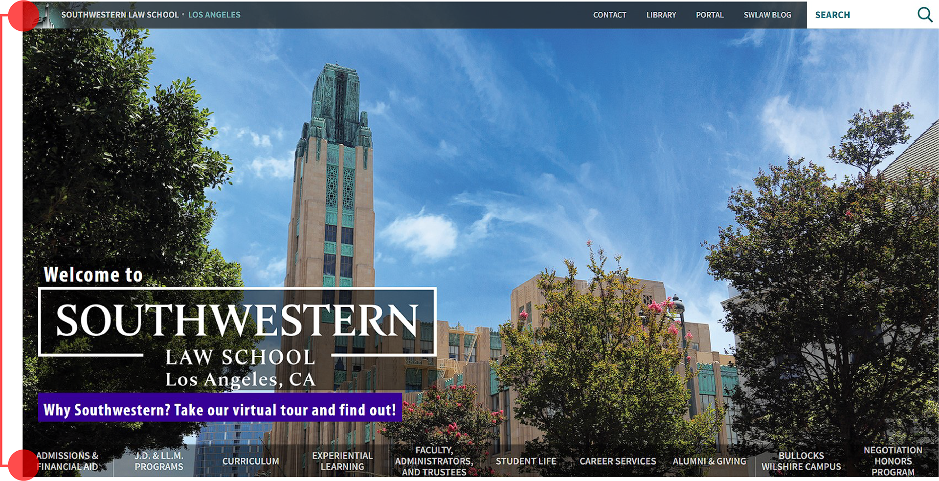
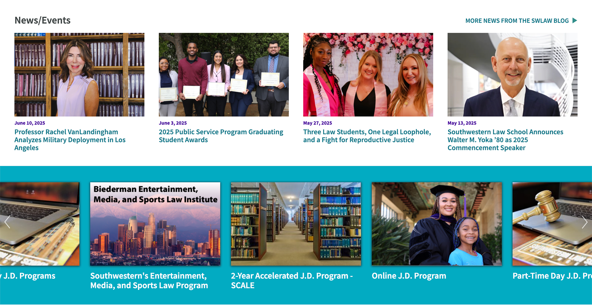
Current
New
Research
Discovering the core users
Focus Group Part 1
I arranged a focus group consisting of 10 first and second-year students to ask them about their process of researching the school before they applied. Due to budget and security constraints, we were only able to gather participants from our existing student body. Some of the insights we found were that they:
Split navigtion bars
• Strongly disliked the confusing split navigation bars
• Were unable to quickly locate information
• Found competitors had better navigation and hierarchy
• Couldn't differentiate sections and avoided interacting with them
• Opted to use Google search rather than navigate the site
• Were unable to quickly locate information
• Found competitors had better navigation and hierarchy
• Couldn't differentiate sections and avoided interacting with them
• Opted to use Google search rather than navigate the site
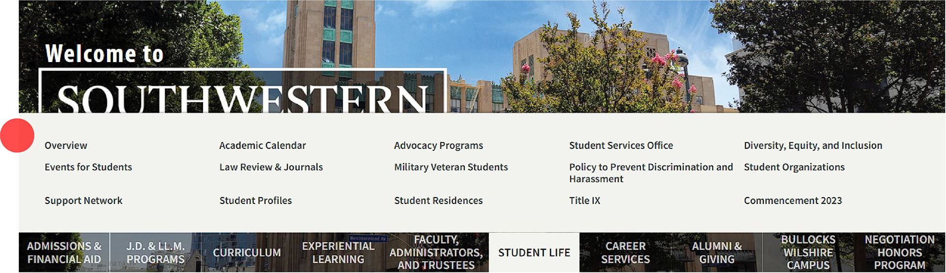
Drop Down (up?)
Sections with no information hierarchy
Design Process
Wireframes
Because we were starting with a previous version, we had a general idea of what we wanted on the page. My job was to understand how to iterate upon that and improve. My process started with brainstorming what else could be added to the site. Through our research, we determined things that prospective students would want to see on our website.
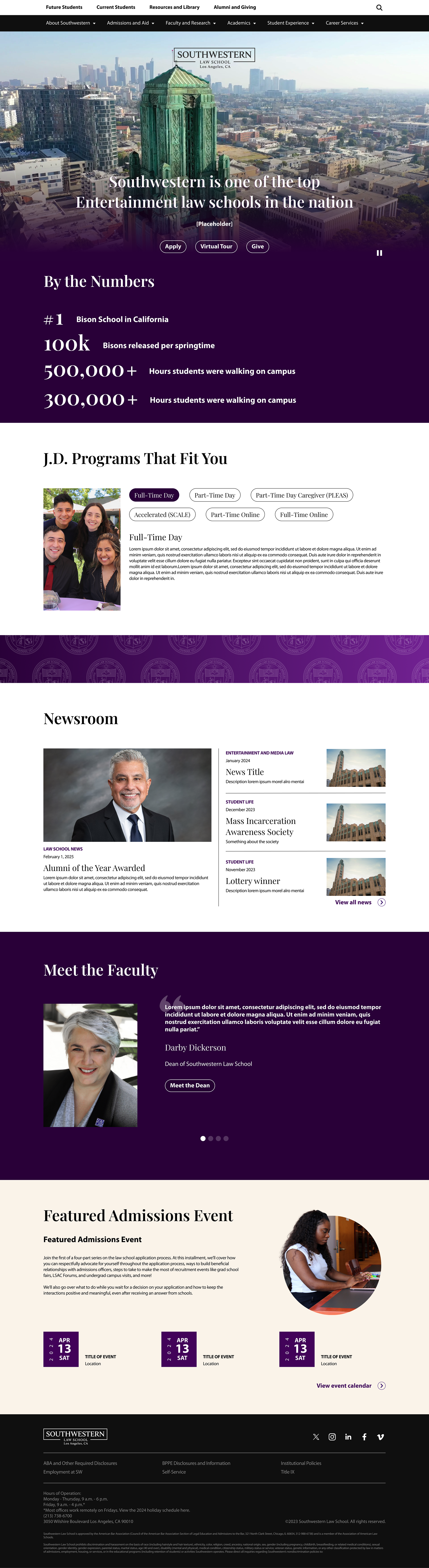
Sections to include:
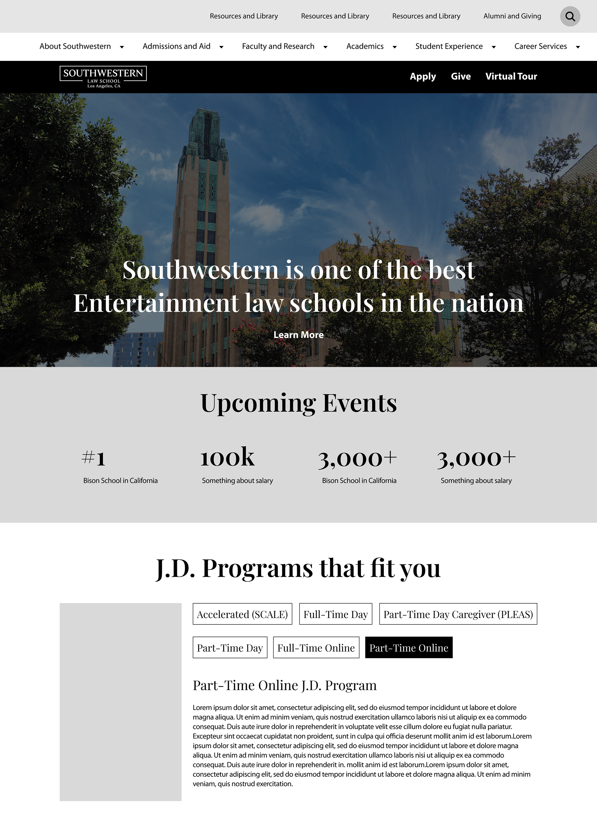
• Strong Hero image with apply and virtual tour CTA's
• Strong Hero image with apply and virtual tour CTA's
• Clear navigation bar with current students and future students tabs
• Appealing stats that make the school stand out
• All the J.D. programs listed out clearly
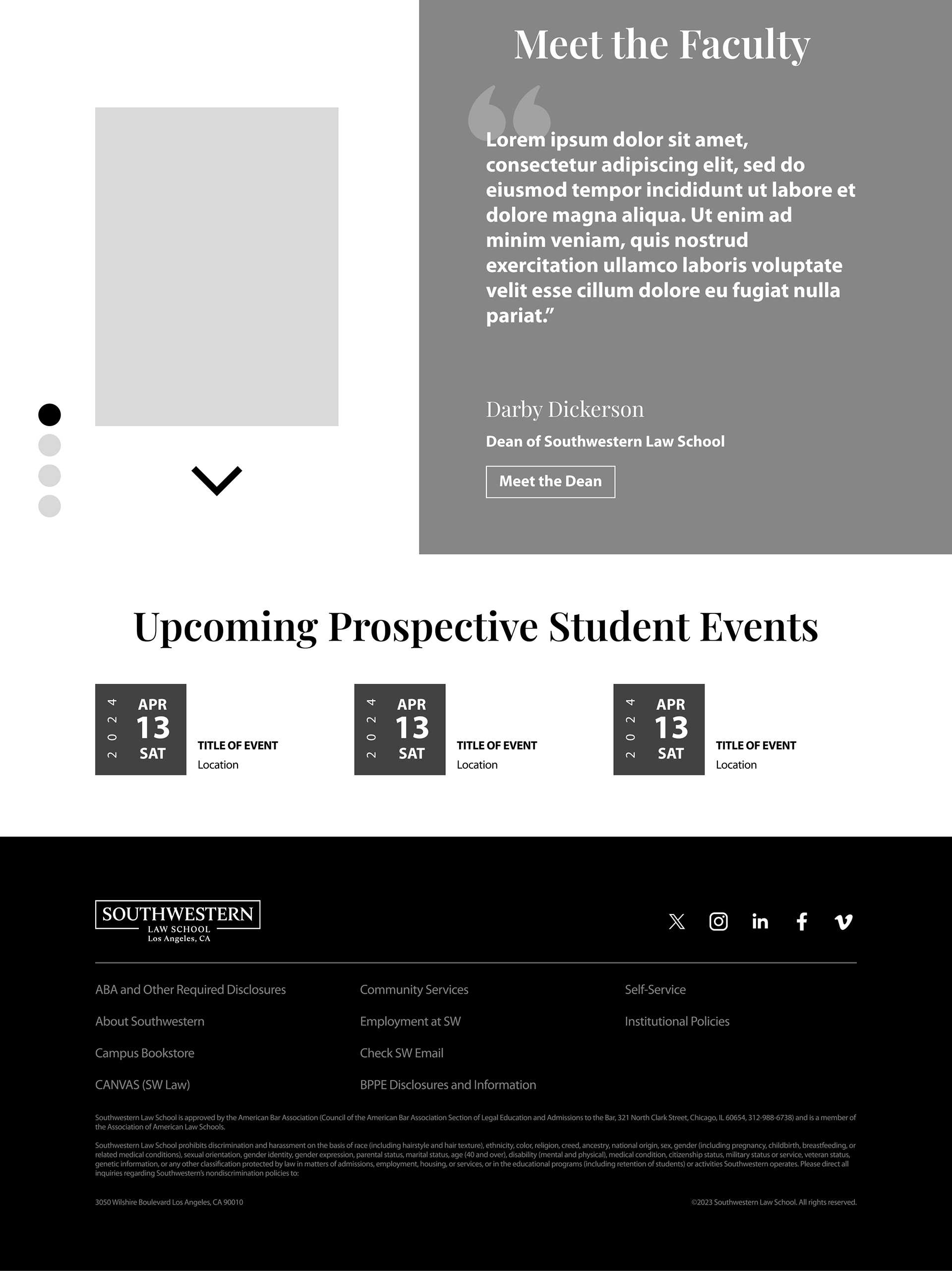
• Newsroom section of relevant events pertaining to the school
• Meet the Faculty section, highlighting popular faculty members
• Appealing stats that make the school stand out
• All the J.D. programs listed out clearly
• Newsroom section of relevant events pertaining to the school
• Meet the Faculty section, highlighting popular faculty members
• Featured events for prospective students
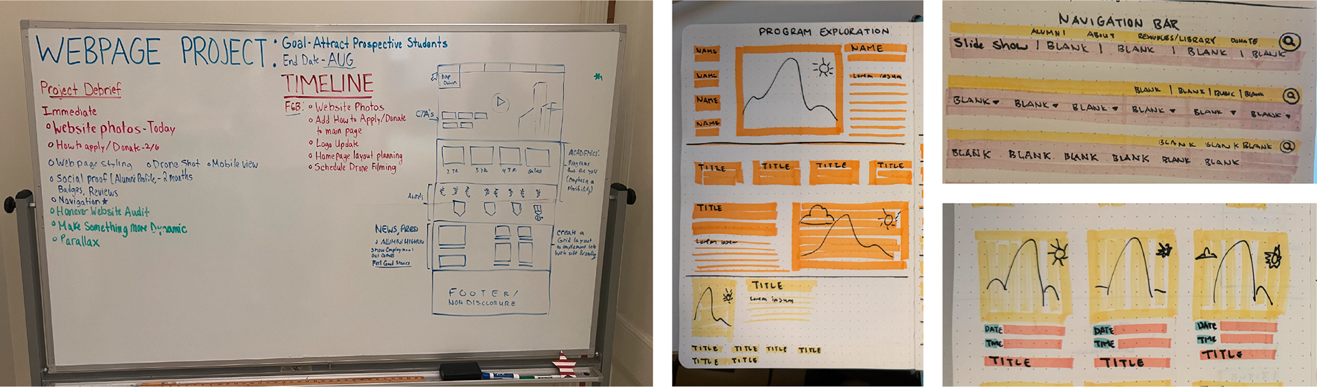
My Approach
Sketching out wireframes on paper for the sections allowed me to quickly iterate and imagine how the whole site might come together. From here, I was able to produce digital wireframes to present to my CMO for feedback.
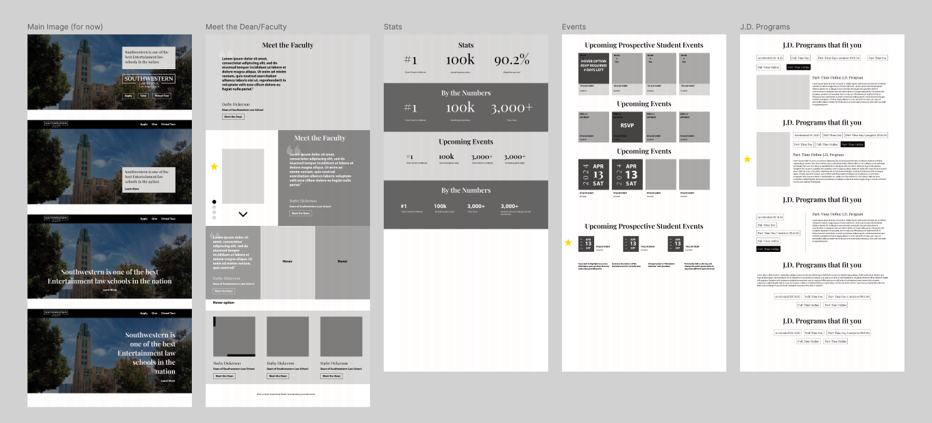
Low-Fidelity Prototype
After producing a low-fidelity prototype and presenting it to the CMO and other stakeholders, I received valuable insights, implemented requested changes, and began designing a High-Fidelity Prototype.
High-Fidelity Prototype
I quickly noticed some pain points as I worked on the received notes and rendered the designs further. I had to figure out a way to find a balance between the two designs.
Some pain points we ran into were:
• Cutting down navigation bar of too many tabs left it more confusing
• Having to click items for more info did not help streamline the process
• The admissions event section needed multiple events
• The admissions event section needed multiple events
• Visually simplifying sections did not improve the user flow
Focus Group Part 2
After iterating more on the prototype, I reached the point where I was ready to receive feedback from our users. This focus group consisted of new students who had not participated in the first one. We received a lot of good insights from these users and I was able to produce a nearly finished design.
Development
Launching the site
Southwestern Law School has a 3rd party company of engineers that I was able to meet with and discuss the next steps of launching this page. While working on this project, I had to understand the limitations of our capabilities and design within the scope of our budget. As the design for this project is nearing its last stages, we are preparing for the next steps to launch this site before the end of the year.
Key Takeaways
Leading this website redesign was the first UX/UI project that I had ever worked on. As a member of the small Communication and Marketing Department at Southwestern Law School, which is a non-profit higher education organization, there were many pitfalls to maneuver around. Due to the small team, I had to learn to wear a lot of shoes and teach myself many new skills.
While it was a natural change as a graphic designer, this project taught me the intricacies of managing a project and communicating my ideas and work process to different groups of people. I was able to grow, not only as a designer, but as a collaborator, facilitator, and researcher. I am excited for the next step in this process and to see how much of an impact it will have on our website retention rates.