"Are you on Yelp?"
"No, I'm on...
Context
An app for food trucks
Project: Food Truck Mobile App
Role: End-to-end Product Designer (Research, UX, UI)
Team: Case Study for the Google UX Course
Tools: Figma, Adobe Creative Suite (Illustrator, Photoshop)
Problem
No modern solutions
People enjoy food trucks but lack a simple way to locate them and order ahead, leading to frustration, wasted time, and missed opportunities
Key Painpoints:
• No reliable method to track food truck locations
• Long wait times due to on-site ordering
• Difficulty discovering food truck events
• Long wait times due to on-site ordering
• Difficulty discovering food truck events
Goal:
Design an app that blends food delivery service standards with custom features tailored to the food truck experience:
Design an app that blends food delivery service standards with custom features tailored to the food truck experience:
• Enable ordering ahead and real-time location tracking
• Streamline event discovery and allergy accommodations
• Streamline event discovery and allergy accommodations
Research
Discovering what people need
I began by researching both users and other food delivery and grocery apps to understand how users navigate these spaces.
Initial Constraints
• No direct competitors to benchmark
• Small interview pool (5 participants)
• Self-imposed timeline and self-defined goals
• Lack of experienced team feedback
• Small interview pool (5 participants)
• Self-imposed timeline and self-defined goals
• Lack of experienced team feedback
Interviews
I conducted five user interviews focused on food delivery habits and food truck experiences. This helped shape core use cases and identify customer needs in real-world contexts.
User Personas
To expand my design perspective, I created personas from varied backgrounds. One was inspired by my experience as a new uncle observing the changes in my sibling's life. I wanted to highlight the challenges of a young parent managing a child while ordering food.
Storyboarding
Using these personas, I storyboarded typical user journeys. This immediately exposed different pain points, like:
• Standing in line as an accessibility issue
• Food trucks running out of stock frequently
• Allergy concerns beyond what a basic notes section can handle
• Food trucks running out of stock frequently
• Allergy concerns beyond what a basic notes section can handle
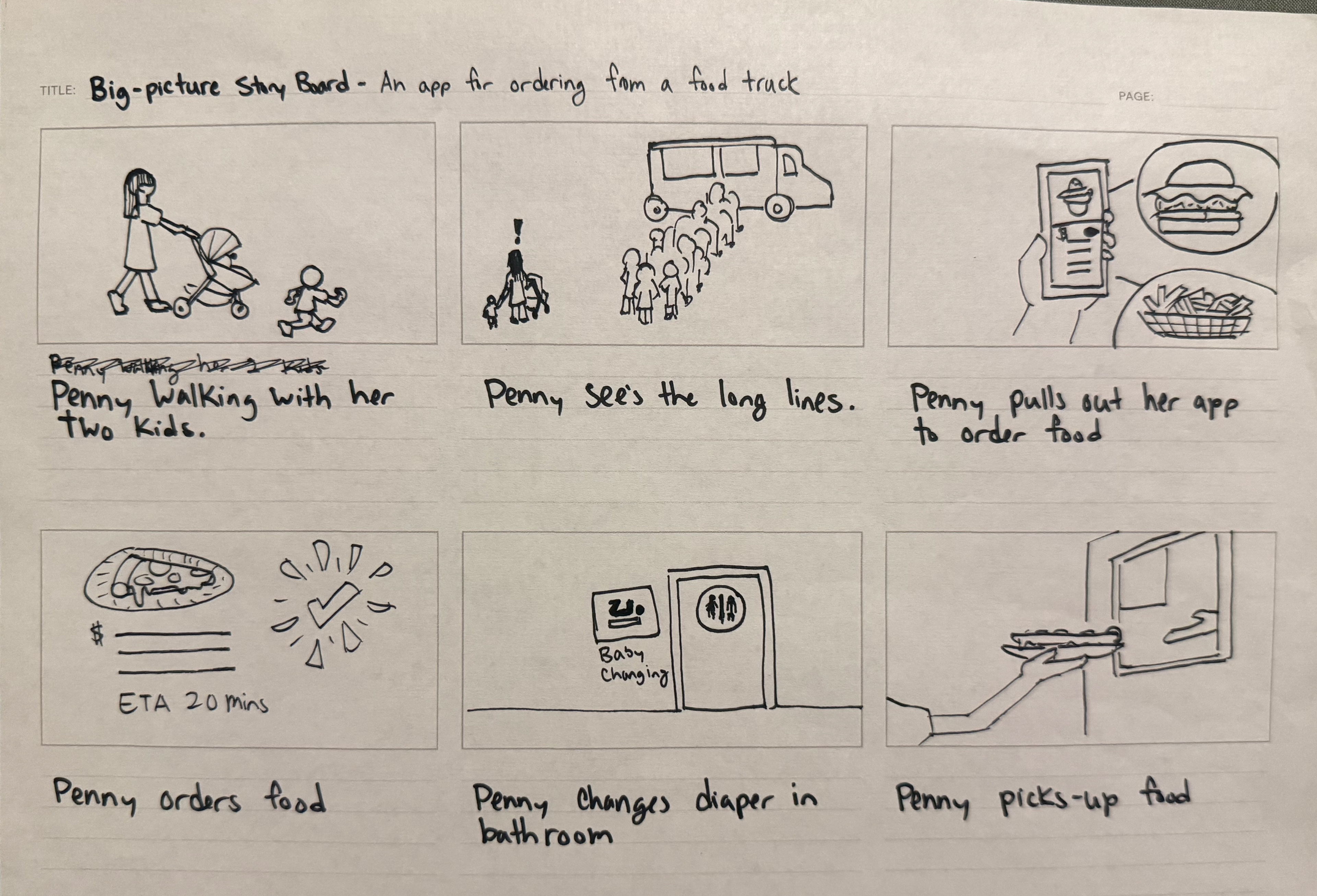
Storyboard of a young mother being able care for her kids by ordering online
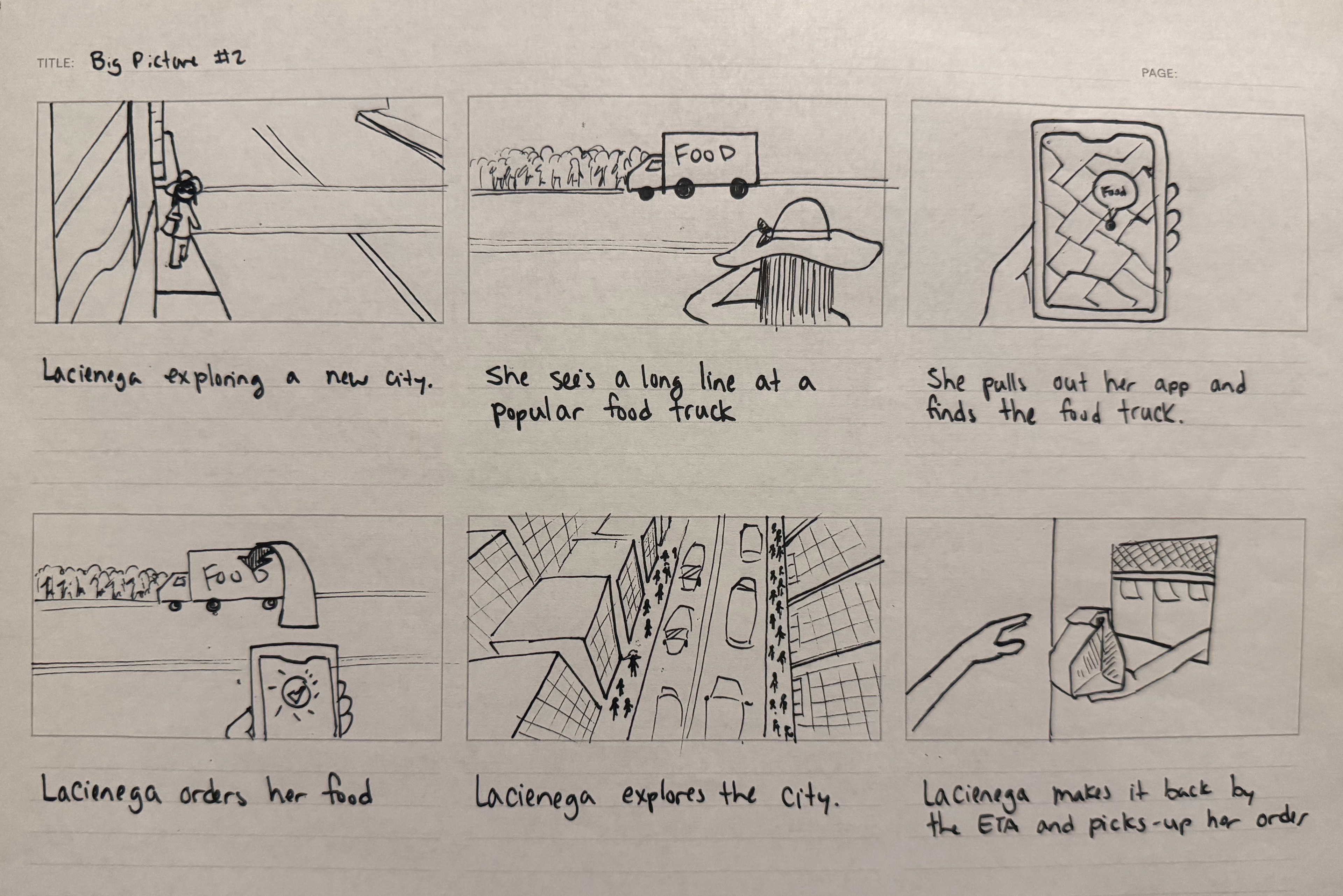
Storyboard of a tourist exploring a city and saving time by ordering ahead
Design Process
Wireframes
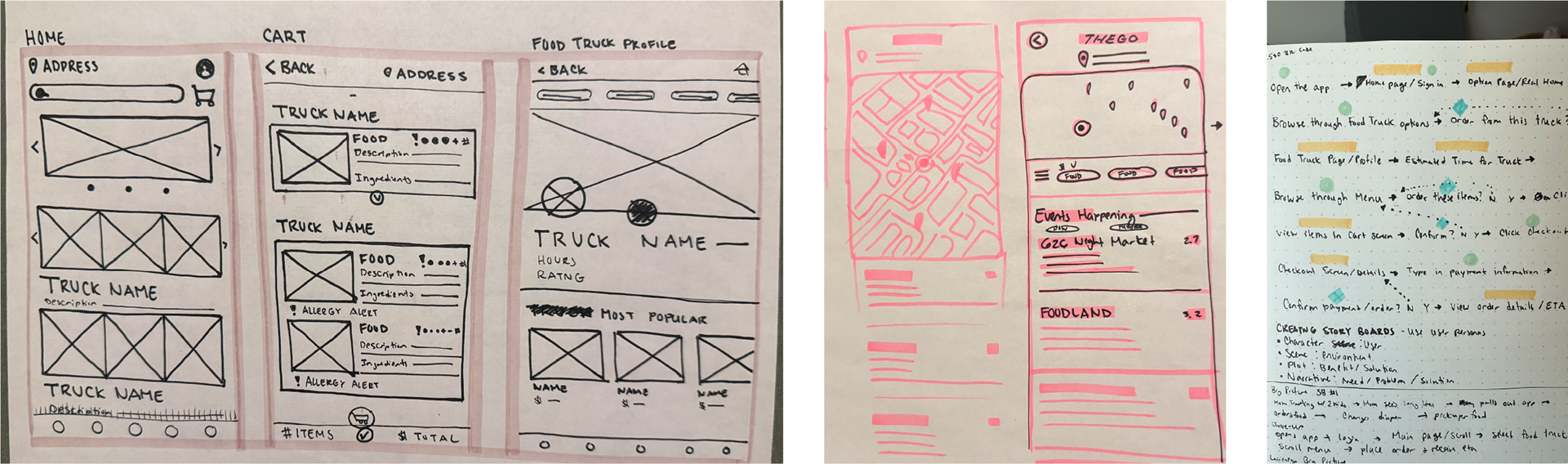
I translated research insights into a user journey map that informed me of the specific screens and features that I would want to include. I sketched the first wireframes, writing notes as to which features I wanted to include on the screens. This helped me gain a quicker understanding of how the layout was supposed to look like and allowed me to quickly see what was and wasn't working.
Screens to include:
• Home
• Food truck Profile
• Item fill out card
• Cart & Check out• Discover
• User Profile
• Food truck Profile
• Item fill out card
• Cart & Check out
• User Profile
Low-Fidelity Prototype
After transferring the wireframes into a low-fidelity mockup, I conducted some early usability tests. I asked users to try and navigate the app by giving them specific instructions. While the discover section of the app was received well, they shared some feedback on the checkout process.
Some of these things were:
• Lack of notifications made users unsure if actions (like adding to cart) were successful
• The Gestalt principle of proximity came into play when users were confused due to a lack of spacing between elements
• Typography and image layout caused navigation errors
• The Gestalt principle of proximity came into play when users were confused due to a lack of spacing between elements
• Typography and image layout caused navigation errors
Low-fidelity prototype of the Home, Food Truck Profile, Cart, and Checkout Screen
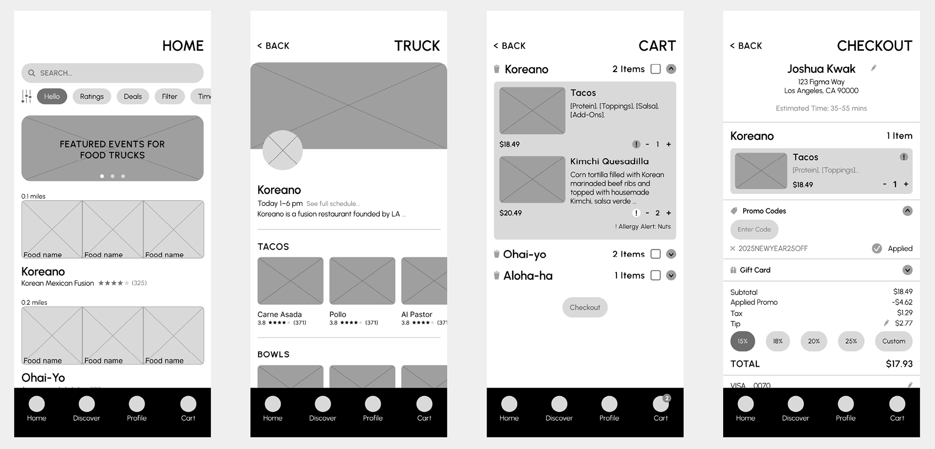
High-Fidelity Prototype
After iterating on the low-fidelity prototype and incorporating some of my feedback, I was able to develop a High-Fidelity Prototype. As I refined the designs, users were able to connect with the process more. They realized there were still some things about the checkout process and discover page that were disrupting the user flow.
Some pain points were:
• Allergy section lacked clarity
• Pickup time bar was confusing
• Users wanted sticky “Add to Cart” and “Checkout” buttons
• Discover page lacked sorting/filtering options
• Entry fees and price ranges were missing from event descriptions
• Pickup time bar was confusing
• Users wanted sticky “Add to Cart” and “Checkout” buttons
• Discover page lacked sorting/filtering options
• Entry fees and price ranges were missing from event descriptions

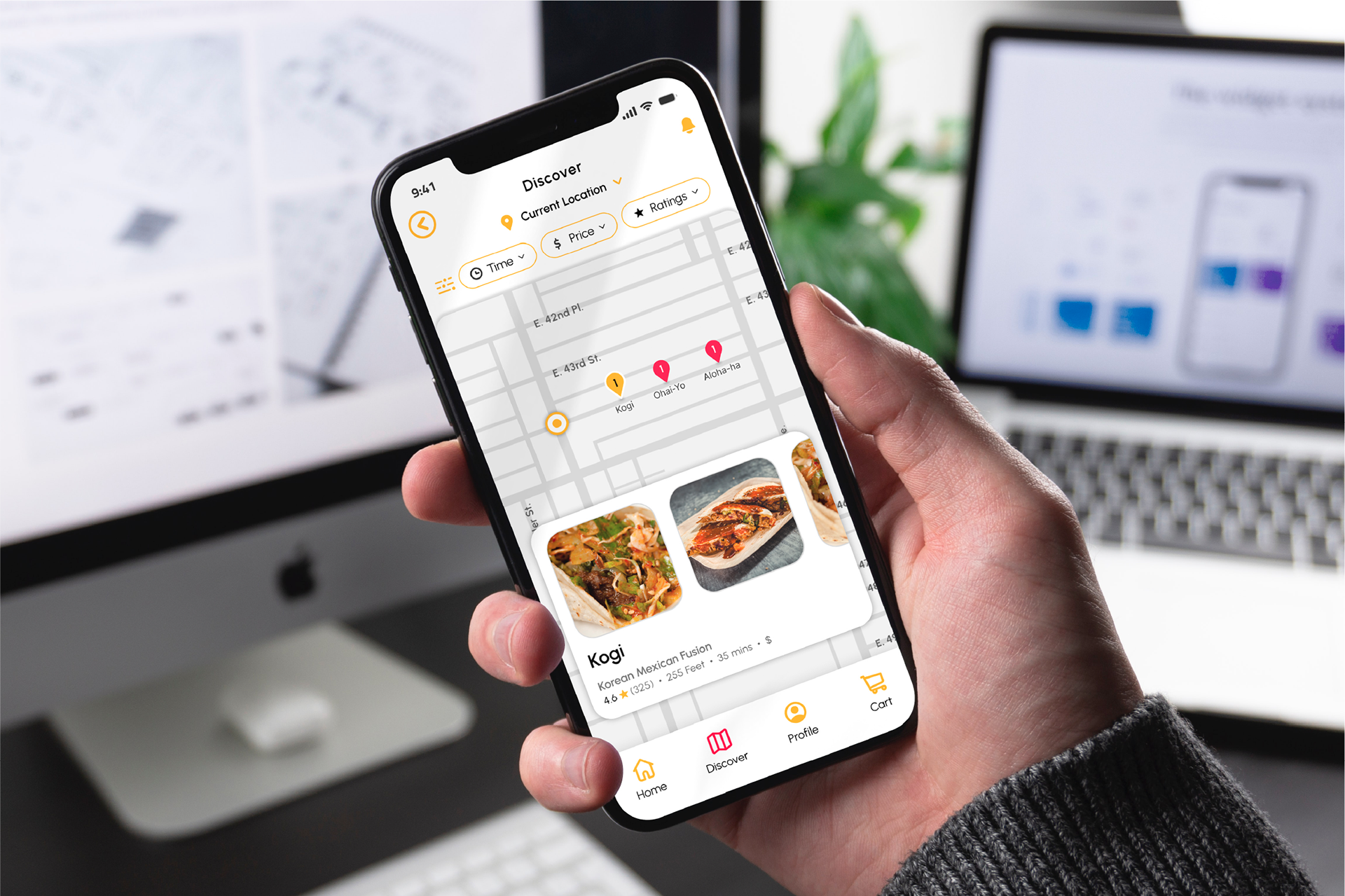
The development of the discover screen from low-fidelity, high-fidelity, to the final
Finalizing the Designs
Based on user feedback, I refined my designs to create a more intuitive and informative experience. While I considered all input, some suggestions were adapted to real-world constraints. For instance, instead of displaying entry fees (which vary and require external purchases), I linked out to external event pages. In the end there were quite a few features that I had improved upon through iteration and included in the final designs.
Some final features to note:
• Live GPS food truck tracker
• Potential allergy alerts built into ordering cards
• Color-coded stock indicators (e.g., “Low Stock”, “Out of Stock”)
• Potential allergy alerts built into ordering cards
• Color-coded stock indicators (e.g., “Low Stock”, “Out of Stock”)
Metrics
Upon my final user testing, 5 out of 5 users successfully completed the checkout process and comfortably navigated the discover section.
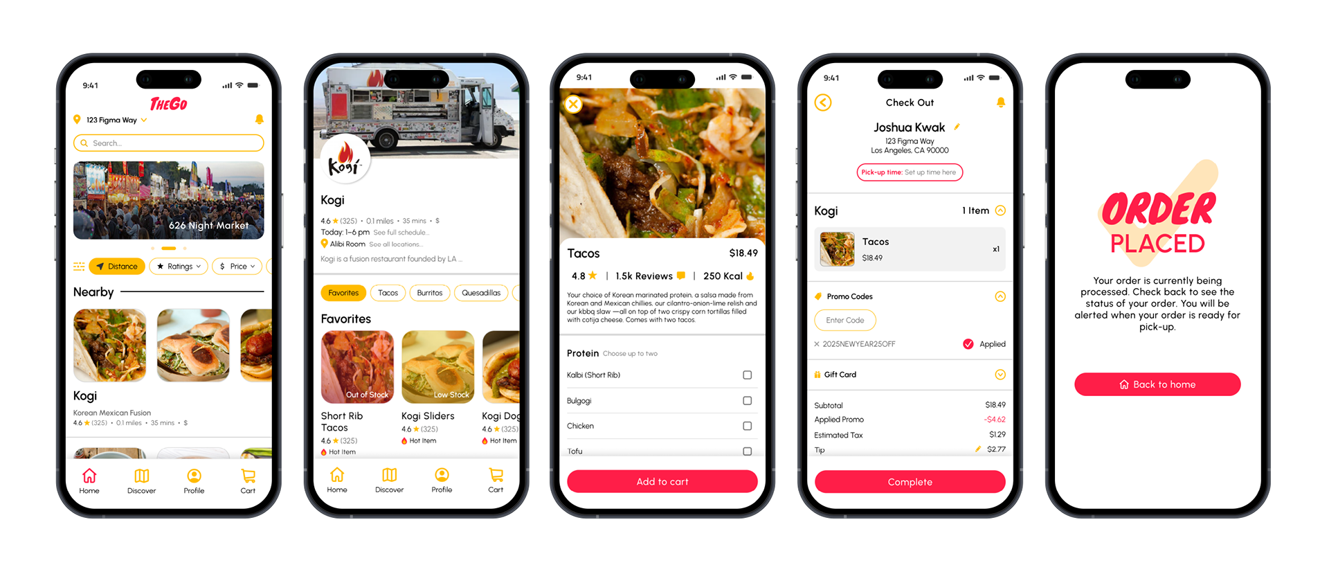
Five screens to show the item checkout process
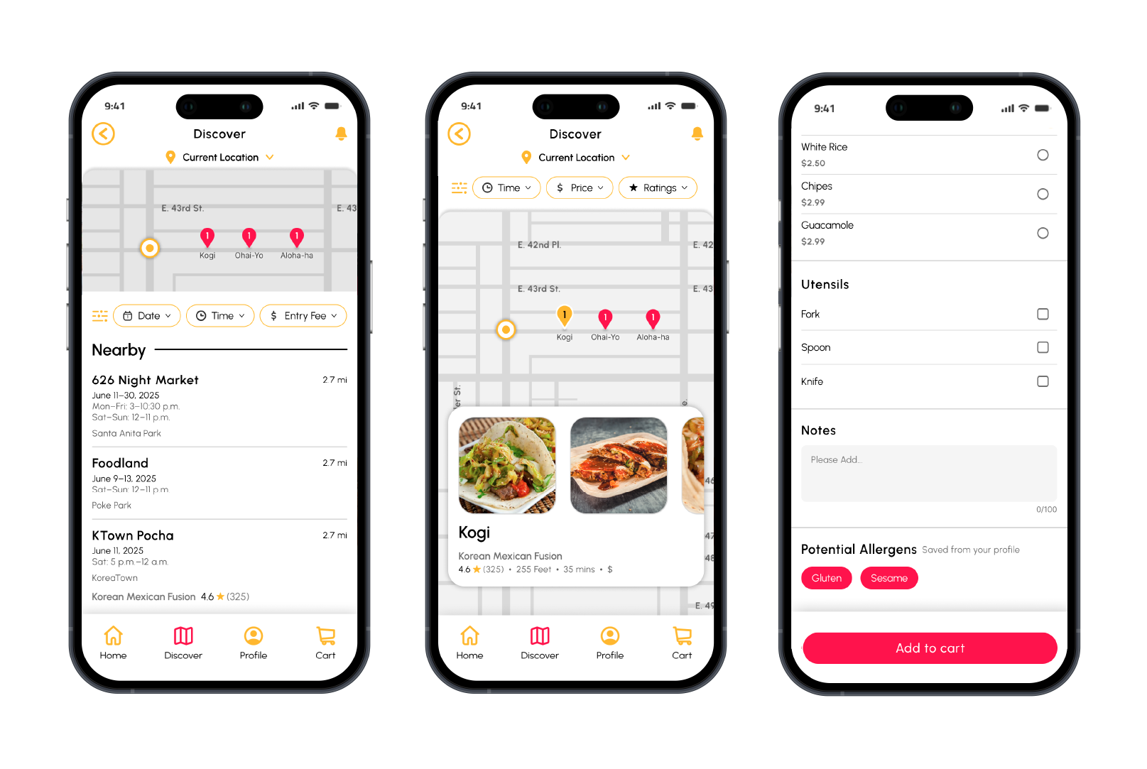
GPS Live tracking feature, and the Allergy alert feature in the food card
Reflection
Key Takeaways
I was confident in visual storytelling, but product design challenged me to think beyond aesthetics. This project taught me how to design an experience from the ground up, centered on real user needs. It pushed me to combine empathy, research, and design to create something both functional and impactful.
Where I grew
• Learned to empathize with users and design more inclusively
• Practiced real research, testing, and iteration
• Sharpened my Figma and prototyping skills
• Sharpened my Figma and prototyping skills
What I would improve for the future
• Focus more on user flow than on perfecting early wireframes
• Distinguish between helpful and distracting feedback
• Design with accessibility and mobile touch targets in mind
• Design with accessibility and mobile touch targets in mind
Culminating Thoughts
I’m very proud of my final product! While this was just a case study, it pushed me to really think beyond myself and understand how differently people think.